DICE Web
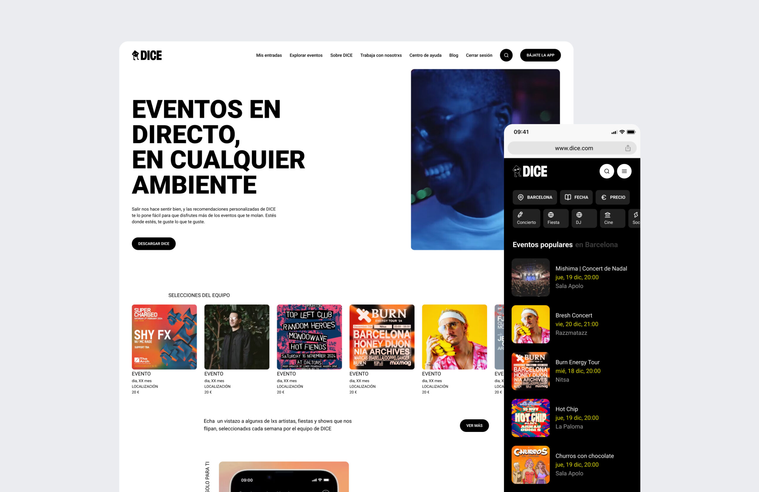
DICE is a platform for discovering and purchasing tickets for live events, concerts, and festivals. The project aimed to boost ticket sales by focusing on improving the desktop version, specially in two main areas: improving the web ticket purchasing system, which felt incomplete compared to the app, and making special events more visible across the site to drive engagement and conversion.
PROBLEMS & CHALLENGES
DICE faces two problems: a lack of visibility for special events, which impacts engagement and sales, and a ticket purchasing process that relies heavily on the app, creating friction for web users.
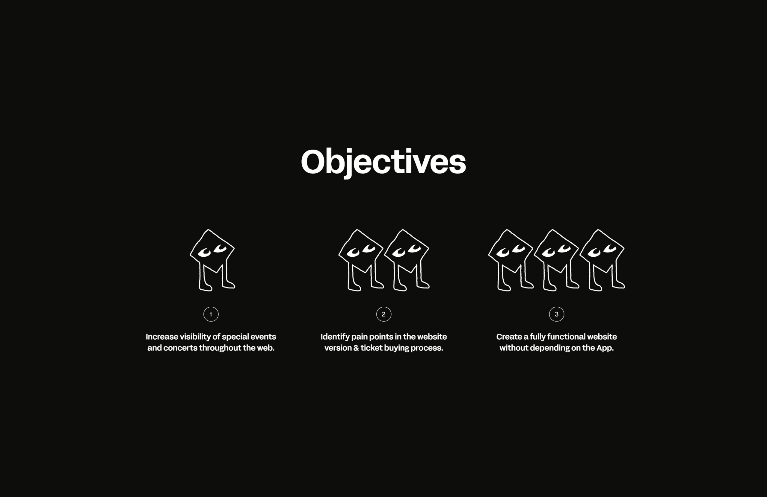
Design challenges are to improve the visibility of special events and concerts across the website, address pain points in the ticket purchasing process, and develop a fully functional website that operates independently from the App.
Design challenges are to improve the visibility of special events and concerts across the website, address pain points in the ticket purchasing process, and develop a fully functional website that operates independently from the App.
RESEARCH
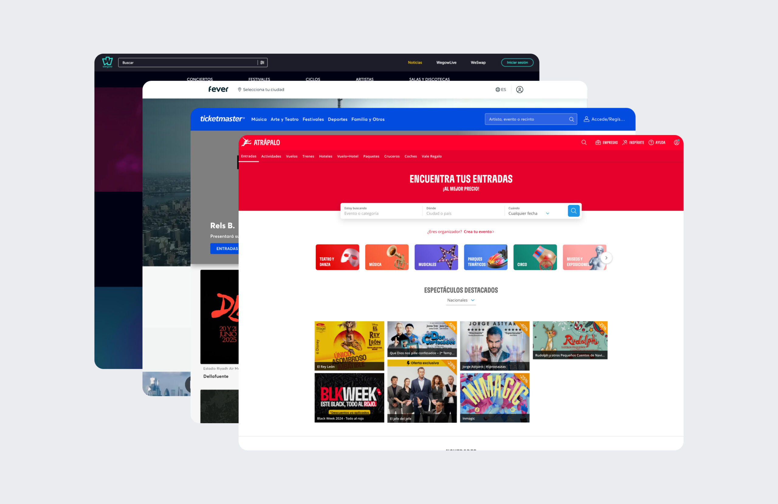
To address these challenges, I conducted a benchmark to analyze direct competitors like Ticketmaster, Fever, and Wegow, as well as indirect ones like Airbnb, Atrápalo, and Cinesa. This research focused on event showcasing, checkout models, and ticket sales to identify best practices.
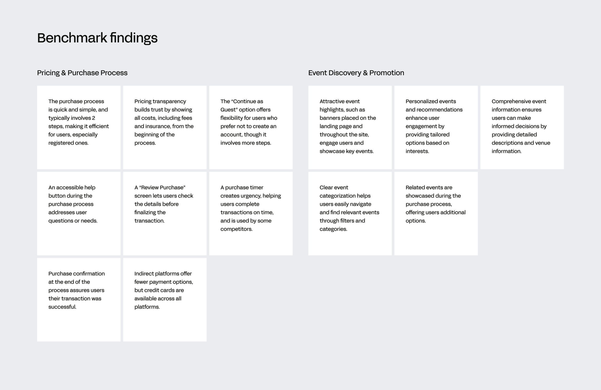
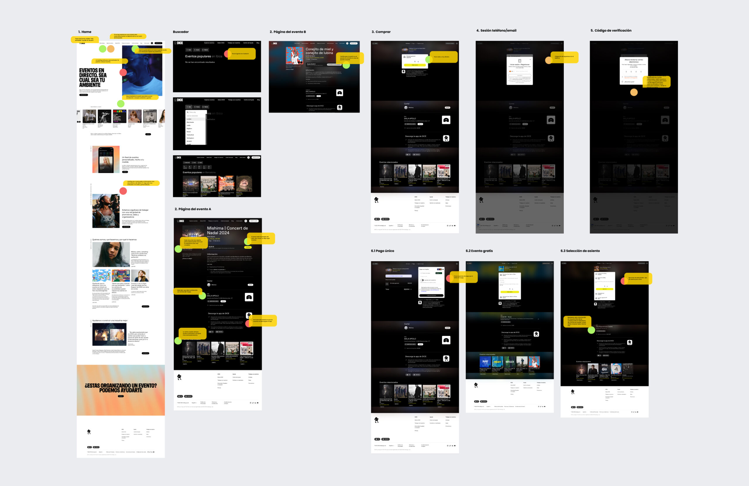
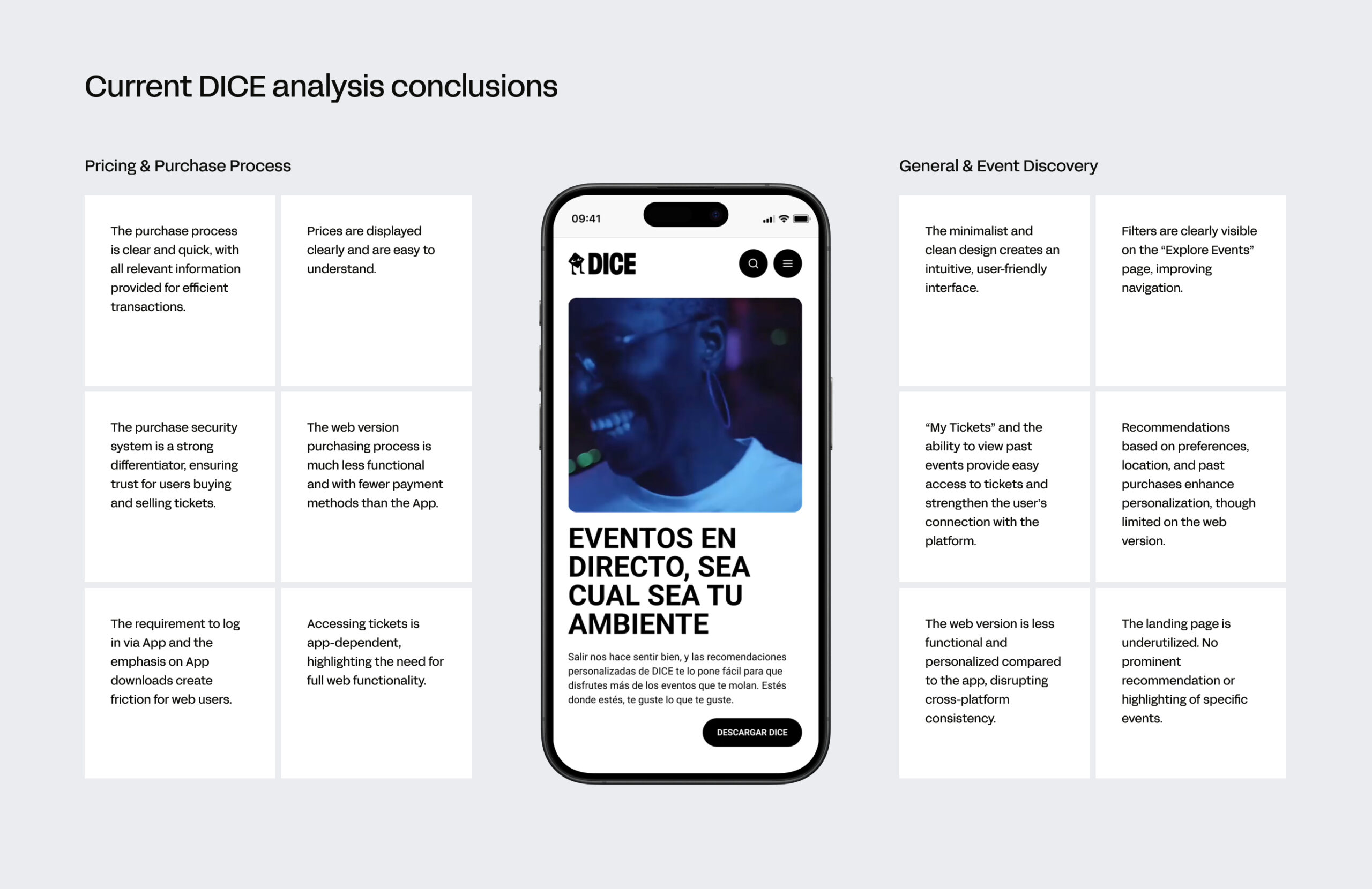
DICE’s current purchase process and event showcase methods were also analyzed to identify friction points and areas for improvement. The focus was on understanding how current events are highlighted, including showcase methods, categories, and filtering options. This analysis revealed key pain points in both the purchasing process and event showcase, highlighting areas for improvement.
INSIGHTS & DESIGN DECISIONS
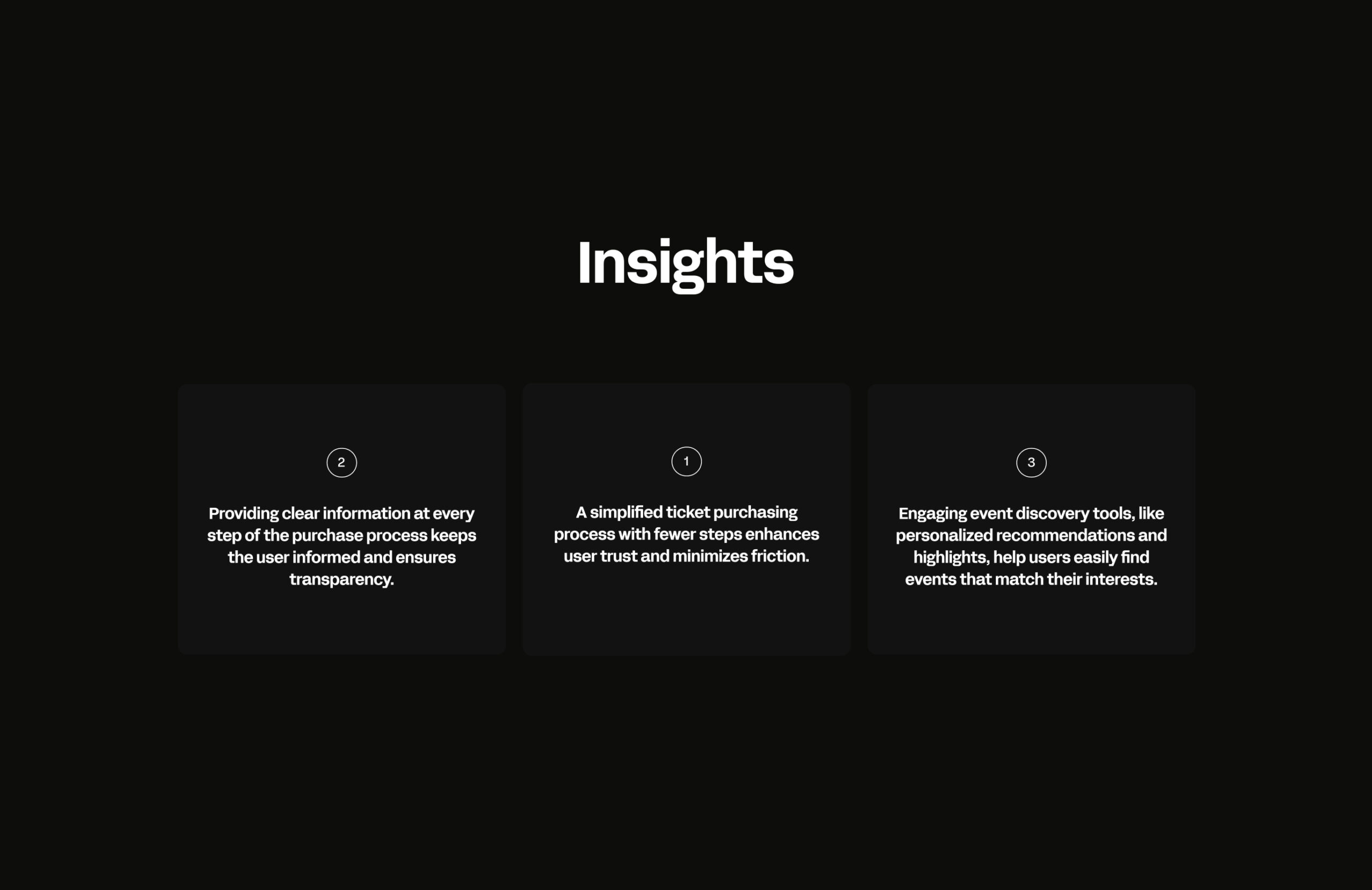
Based on research, I identified three actionable insights: simplifying the ticket purchase process with fewer steps builds trust and reduces friction, clear and transparent information ensures a smooth experience, and personalized recommendations and highlighted events improve user satisfaction and engagement.
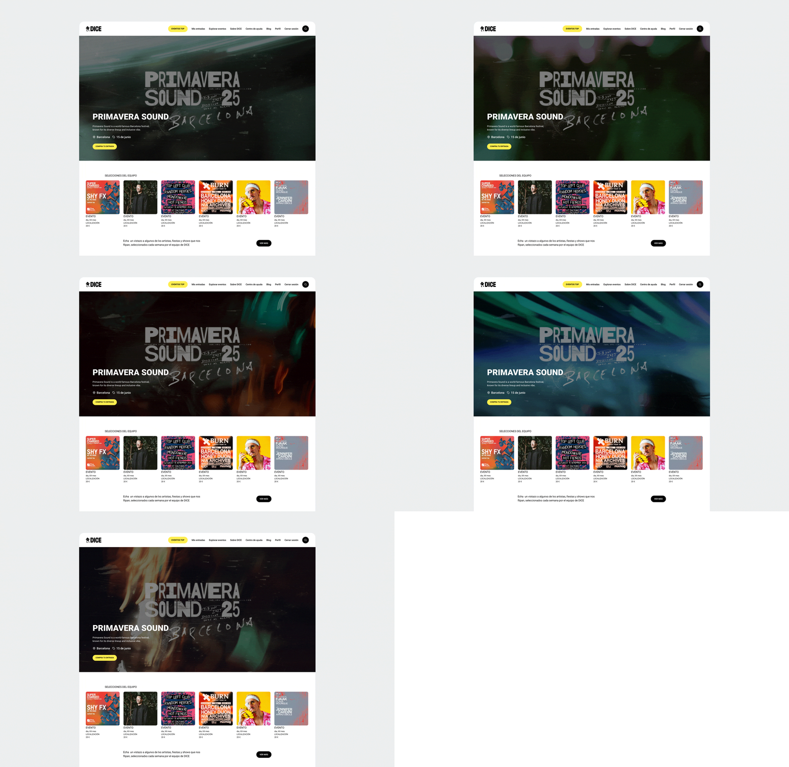
Two key design solutions were defined: first, creating a versatile element to promote events, applicable across various touchpoints on the website. Second, simplifying the purchasing process by reducing the number of steps and ensuring full functionality on the web, without relying on additional steps dependent on the app.
Two key design solutions were defined: first, creating a versatile element to promote events, applicable across various touchpoints on the website. Second, simplifying the purchasing process by reducing the number of steps and ensuring full functionality on the web, without relying on additional steps dependent on the app.
SOLUTIONS
A prominent hero banner was introduced on the landing page to enhance event promotion and immediately capture user attention, ensuring that key events stand out. Additionally, a dedicated “top events” button was added to the main menu, providing users with easy access to the most popular or highlighted events.
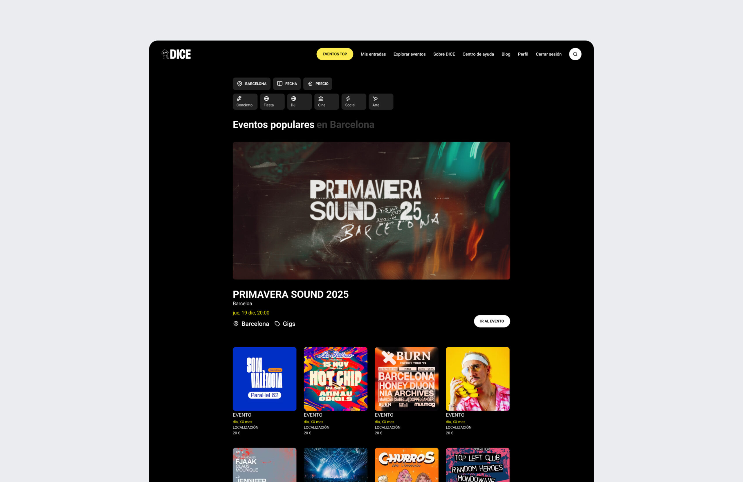
Flexible secondary banners were placed across various sections of the website to expand event visibility. These dynamic banners appear as needed to highlight events, promotions, or important content, increasing user engagement and ensuring key events remain prominent.
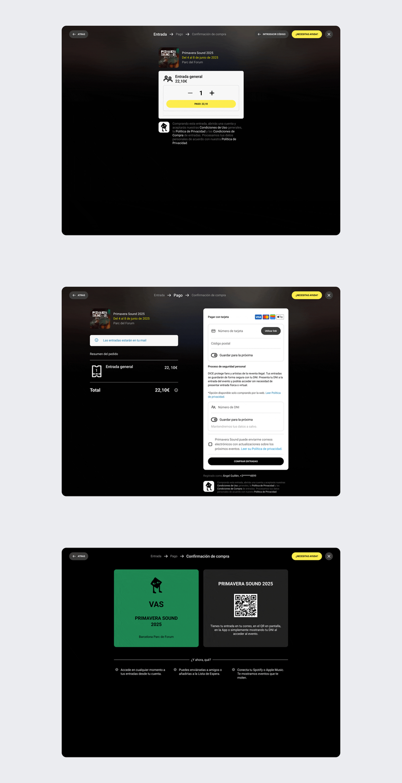
The purchase process has been simplified to three steps. The website now operates independently from the App, providing full autonomy in managing ticket purchases. Breadcrumbs have been clarified for easier progress tracking, and additional payment methods have been incorporated into the web version, aligning it with the app and ensuring consistency across platforms.
A more visible Help button now provides continuous support throughout the purchase process. Users can optionally now use an ID number for event access, eliminating the need for the app or mobile tickets and enhancing security. The purchase confirmation clearly explains how users can access their tickets—whether via email, the app, or ID—ensuring a fully informed experience.
A more visible Help button now provides continuous support throughout the purchase process. Users can optionally now use an ID number for event access, eliminating the need for the app or mobile tickets and enhancing security. The purchase confirmation clearly explains how users can access their tickets—whether via email, the app, or ID—ensuring a fully informed experience.